
Reorganised from the archived print spec guide and the canvas tote product data, with commercial terms and banned figures left out.
Two merchandisers read the same line on a spec sheet, "Body colour: PMS 485 C," and ordered two different reds. One approved a warm tomato; the other rejected the shipment as orange. The number was identical in both files, and neither buyer had written down what the number was supposed to sit on.
That gap is the most common colour failure in bag sourcing. A Pantone reference gets treated as a lock, when it is closer to an address without a street name. The ink, the fabric and the light all get a vote before the colour reaches a customer’s hand.
The spec sheet that looked complete

The sheet had a logo, a size, a handle style and a colour code. Every field a buyer expects to fill was filled. It read like a finished document, and it moved through approval without a single question.
What it did not say was which fabric the ink would land on, which print route would carry it, or which Pantone library the code came from. Those three blanks sat under a line that looked settled.
A canvas tote is specified by weight, handle style, size and a natural or dyed body colour. The colour line is one field among several, and it only works when the fields around it are answered too. Strip them away and the code floats free.
Why a Pantone reference feels like enough
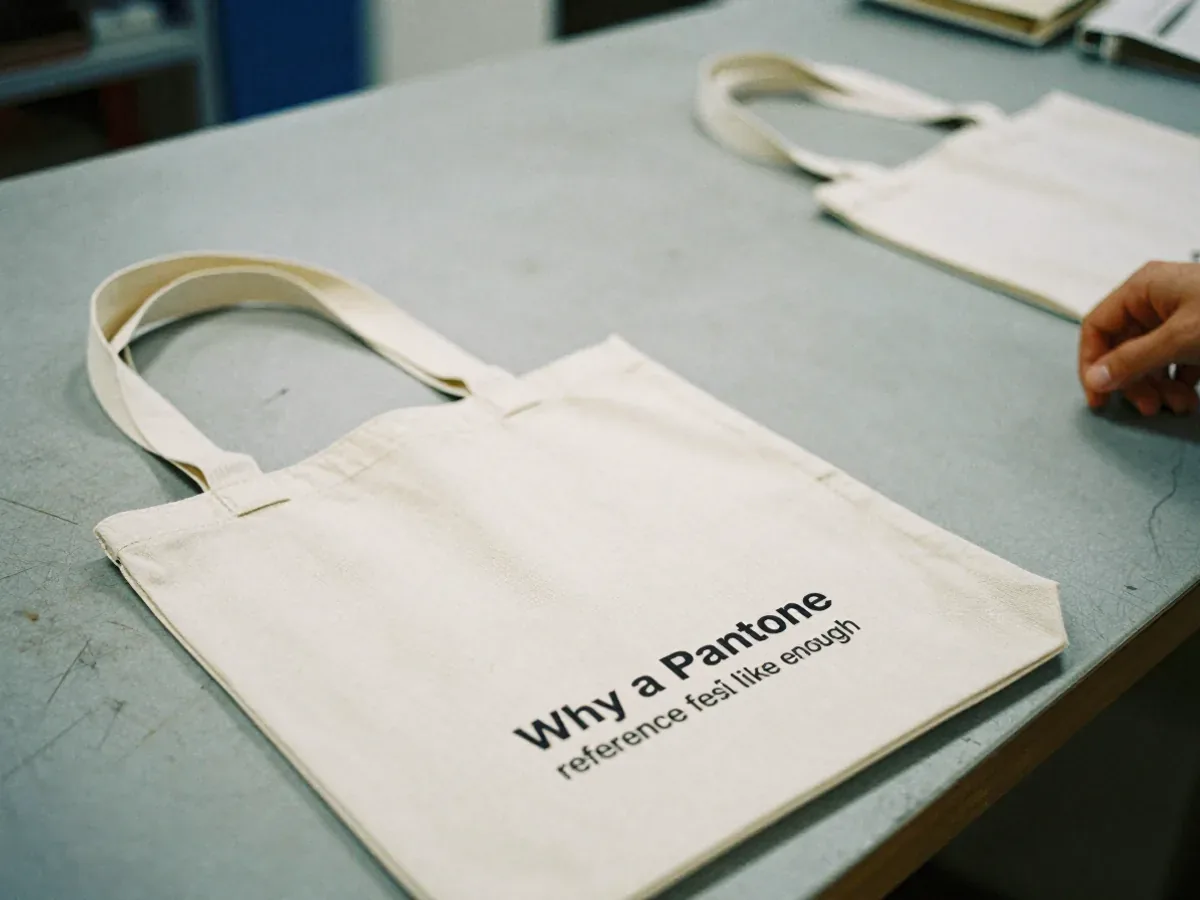
A Pantone chip is a physical object. It has weight, a finish and a number printed on the back. Holding one against a bag feels like a measurement, and that physicality is persuasive.
The system behind it was built for print on paper. Coated stock, uncoated stock, a known ink film, a controlled press. Buyers learned to trust it there, and the trust travelled with the number into categories where the substrate changed.
There is also a practical comfort in a short code. It fits in a spreadsheet cell, it survives a forwarded email, and it gives two people something to point at when they disagree. Ambiguity is expensive to resolve, so a number that ends the conversation gets reused.
What the fabric does to that number

Cotton canvas is not paper. It is a woven, absorbent surface with texture, and the ink sits in and around the fibres rather than on a sealed coating. The same ink volume that reads correctly on a coated sheet can look duller or muddier here.
The library choice matters before the fabric even enters. A code pulled from the uncoated library behaves differently from the same code in the coated library, and fabric does not carry the brightening agents that make coated references pop. Specifying the wrong library moves the target before a drop of ink is mixed.
Then there is the surface itself. A dyed canvas body already has colour in it, and printing onto a coloured ground shifts what the eye reads. Natural canvas pulls warm; a dyed body pushes the print in whichever direction the dye leans. Neither is a defect, and both change the result.
Texture adds a third variable. Woven cotton diffuses light across the print, so a flat ink film picks up a softness that a glossy reference never shows. Under retail lighting the bag can read a shade lighter or heavier than the chip on the desk.
The file that arrives without a substrate
Artwork often arrives as a clean vector logo with a colour callout attached, built at finished size on a neutral background. It looks professional, and it tells the printer almost nothing about the surface it will meet.
Woven cotton moves during printing and finishing, so a logo built at exact finished width can compress or stretch once the bag is sewn and filled. Artwork that ignores this produces a mark that drifts near a seam or reads slightly wide across the body.
Seam placement is the other silent variable. A logo placed without a safe margin from the stitch line can be caught by a fold or clipped by a hem. The print was correct; the position was not.
None of this shows up in a digital proof. A screen render confirms alignment and nothing else. It cannot show how much ink the canvas drinks, how the texture breaks up a fine line, or how the print feels after curing.
Writing the colour so the printer cannot guess

The fix is not a longer colour code. It is a colour instruction with the conditions attached, written so a printer in another building can follow it without calling.
Name the library, not just the number. State the coated reference as the baseline for fabric work, and say so in words rather than leaving the suffix to be inferred. A code without its library is an incomplete instruction.
Name the substrate on the same line. Cotton canvas, natural or dyed, with the weight and the body colour recorded next to the print target. If the body is dyed, note the ground colour, because the print will be judged against it.
Attach a physical reference. A drawdown on the actual production fabric beats any screen image, and a retained swatch of the approved result gives both sides something to compare against later. Stock colours can be swapped for a Pantone match, and that match should be proven on the cloth, not on a monitor.
Set the tolerance in the spec rather than in the argument. Expect a close match, not an identical one, and write that expectation down before the run starts. The print route belongs here too: screen print, heat transfer or a woven label, each proofed before production.
What the first printed sample has to prove

The pre-production sample is the only checkpoint where ink, fabric and stitching meet in one object. It should be judged as a physical thing, in the light the bag will actually live in.
Hold it beside the Pantone chip under neutral light, then again under the warm light of a shop floor. Check the print against the body colour it sits on, not against a white sheet. Look at the edges of a solid fill and a thin line, because absorbent fabric shows problems there first.
Check position as carefully as colour. Measure the distance from the logo to the nearest seam and confirm the safe margin held after sewing. Pull the bag gently and watch whether the print distorts with the fabric.
Confirm the sample was made on the production fabric. A sample printed on a substitute material cannot validate a canvas order, because the ink behaviour and the finished hand feel differ between substrates. Pull, seam strength and bar-tack are tested on every batch, and the colour sample deserves the same discipline.
A short check before you sign the sample
Run through these before the approval signature goes on the sheet.
- The Pantone code carries its library, written out, not implied.
- The substrate is named on the same line as the colour target.
- A physical drawdown exists on the production fabric.
- The sample was printed on that fabric, not a stand-in.
- The logo clears the seam line with a visible margin.
- The print was judged under both neutral and retail lighting.
- The agreed tolerance is written into the spec, not left verbal.
- A retained swatch of the approved result is filed for the batch check.
FAQ
Can a factory match a Pantone colour exactly on a canvas bag?
Expect a close match within a stated tolerance rather than an identical one. Fabric texture and absorbency move the result, so the target should be a proven drawdown on the production cloth, approved before the run.
Should the artwork file be built for canvas or for non-woven?
Build it for the material actually ordered. Canvas and coated non-woven hold ink differently, so a file tuned for one substrate will not transfer cleanly to the other without adjustment.
What should a buyer send with the logo file besides the Pantone number?
Send the library reference, the substrate and body colour, a physical swatch or drawdown, the print route and the accepted tolerance. The number alone leaves the printer to fill in the rest.
Does a digital proof tell you anything about colour on fabric?
It confirms alignment and layout. It cannot show ink absorption, texture or how the print reads under retail light, so it should never replace a physical sample on the production fabric.